
Ecommerce web design built around the buying decision.
Product pages, collections, and checkout paths designed as one system, so browsing turns into confident buying on every screen.

UX strategy comes before the first screen.
We start with how your customers shop: what they compare, what they doubt, what they need to see before paying, and where they leave.
- Buyer intent
- Who arrives from search, ads, email, and social, and what each group already knows about you.
- Catalog shape
- Product count, variants, bundles, and the attributes shoppers genuinely filter by.
- Decision friction
- Price, fit, delivery time, and returns: the doubts that stall a purchase.
- Commercial goals
- Order value, margin mix, and the products the store most needs to move.
Product page design that closes the doubt.
Every element on a product page has a job. We design each one around the question a shopper is silently asking at that moment.
Collection pages built for comparing.
Collections are where shoppers narrow down. We design filters, cards, and sorting around the choices your customers actually make.
- Filters named in the words shoppers use, not internal product codes.
- Cards carry price, finish, and the one detail that decides a click.
- Results update in place, with the count announced, and nobody loses their spot.
6 of 6 products

Stone
Over-Ear Wireless
$329Folds flat for carry-on

Ink
Over-Ear Wireless
$329Same build, darker finish

Stone
Studio Reference
$379Flat tuning for mixing

Stone
Commute Fold
$249Lightest in the range

Ink
Studio Monitor
$289Detachable coiled cable

Stone
Everyday Lite
$199All-day comfort pads
Illustrative catalog. Try the filters to see the layout respond.
Buying journey design, from first look to checkout.
Each page answers a different question. We design the whole path together so nothing breaks between browsing and checkout.


3 of 5
Product pages
Decide
“Am I sure about this?”
Detail media, reviews, and delivery answers placed beside the price, where the decision happens.
- Discover, Home and landing pages: Is this brand for me? Campaign imagery, a clear promise, and an obvious route into the right category within the first screen.
- Browse, Collection pages: Which one fits what I need? Filters in shopper language and product cards that compare at a glance without opening every page.
- Decide, Product pages: Am I sure about this? Detail media, reviews, and delivery answers placed beside the price, where the decision happens.
- Cart, Cart drawer and page: What will this really cost? Clear totals, progress toward free delivery, and quantity edits without leaving the page.
- Checkout, Checkout flow: Is paying quick and safe? Express payments first, fewer fields, visible security, and no surprise steps before the order is placed.
Product storytelling that earns the price.
A studio shot proves the product exists. The story around it proves it is worth owning. We plan every layer of product content before visual design begins.
Imagery that shows who the product is for and the setting it belongs in, before a single spec appears.

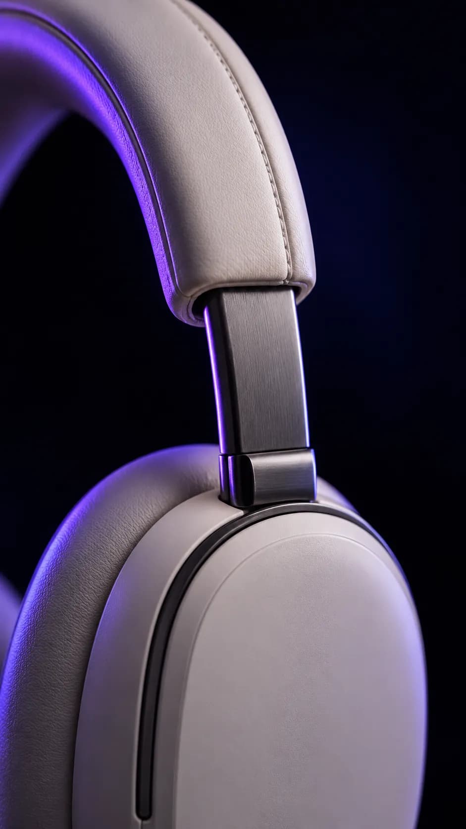
Close crops of texture, stitching, and hardware that make the price feel justified.

Reviews with photos and fit notes, placed next to the moment a shopper starts to doubt.

Lighter than they look, and comfortable through a long flight.
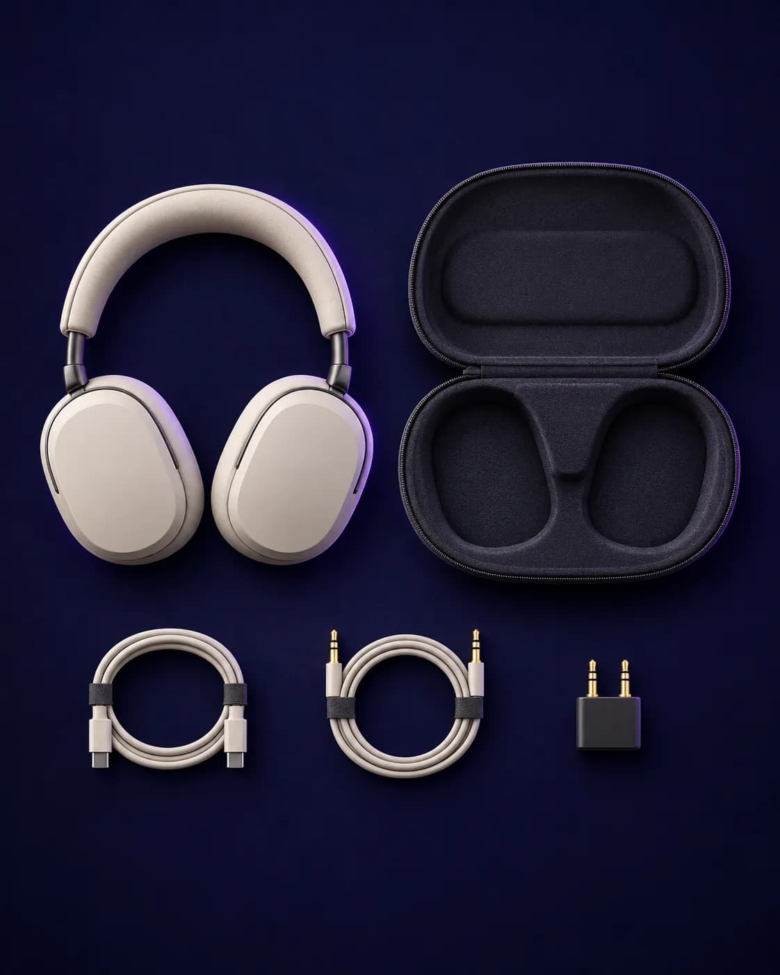
The four facts people compare, shown as quick answers, with the full sheet one tap away.
- Battery
- 30 h
- Weight
- 254 g
- Charge
- USB-C
- Pairing
- 2 devices
Mobile-first ecommerce design, for the thumb.
Most store visits start on a phone. Mobile gets its own layout decisions instead of a desktop page squeezed into a narrow column.
Thumb zone first
Primary actions live in the lower half of the screen, where one hand reaches without shifting grip.
A buy bar that follows
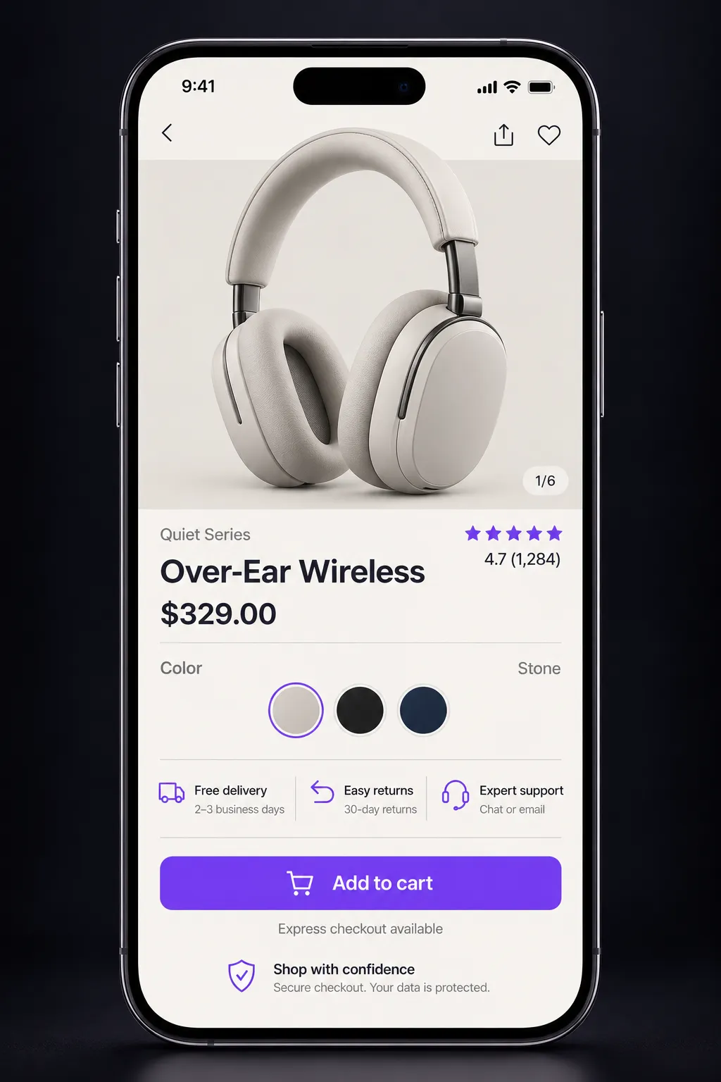
Price and add to cart stay in reach after the shopper scrolls into details and reviews.

Illustrative mobile product page with a sticky buy bar.
Targets sized for fingers
Swatches, filters, and quantity steppers are at least 44px, with space between them.
Less typing at checkout
Autofill, address lookup, and express wallets remove most of the fields people abandon.
Conversion-focused design puts trust where hesitation happens.
Shoppers rarely leave because of one big problem. They leave at small moments of doubt. We map those moments and design the reassurance that belongs there.
Proof sits beside the price, not below the fold.
Rating, review count, and the most useful photo review appear next to the decision, so value and social proof are read together.
No surprise costs
Delivery price, taxes, and arrival dates are shown on the product page, before the cart.
Returns in plain words
A one-line policy under the button, with the full terms one tap away.
Confidence at the button
Express wallets and recognised payment marks placed at the exact moment of commitment.
Help within reach
Chat, sizing help, and contact options visible on product and checkout pages, not hidden in the footer.
Responsive design systems for stores that keep growing.
We hand over components and rules, not a folder of page mockups. New products, campaigns, and collections launch without redesigning the store.
- 1
Tokens
Color, type, spacing, and radius defined once.
- 2
Components
Product card, buy box, filters, and cart, with every state.
- 3
Sections
Flexible blocks for campaigns, stories, and comparisons.
- 4
Templates
Home, collection, product, cart, and content pages.
- 5
Breakpoints
Each layout decided at phone, tablet, and desktop widths.
On Shopify
Designs map to sections and blocks your team edits in the theme editor, metafields for specs and size guides, and theme settings tied to the design tokens.
Headless and custom
A documented component library and content model, ready for Next.js, Hydrogen, or the stack you already run.
How the design work runs.
Five stages, each ending in something you can review, question, and approve before the next begins.
- 1
Discover
Analytics review, customer research, competitor journeys, and a catalog audit.
You receiveFriction map and design priorities
- 2
Map
Buying journeys, site structure, and wireframes for the templates that matter most.
You receiveUser flows and wireframes
- 3
Design
Visual direction first, then product, collection, cart, and content pages at every breakpoint.
You receiveResponsive page designs
- 4
Prototype
Clickable mobile and desktop prototypes tested with real shopping tasks before anything is built.
You receiveTested prototype and revisions
- 5
Hand off
Component specs, states, and motion notes, plus design support while the store is developed.
You receiveDesign system and build support
Questions about ecommerce design.
Something else on your mind? Ask it on a short project call.
Show us where your shoppers hesitate.
Share your store and goals. We will review the buying journey and outline the design work that would move it forward.
Start your ecommerce design enquiry
Tell us what needs to move.
Share the bottleneck, the timing, and what a useful outcome looks like. We review the context and reply with a useful next step.
Prefer email? hello@eaglexor.com